Our Custom Visuals
Explore the suite of Power BI custom visuals developed by Dunboxed — crafted for performance, design, and real-world insights.
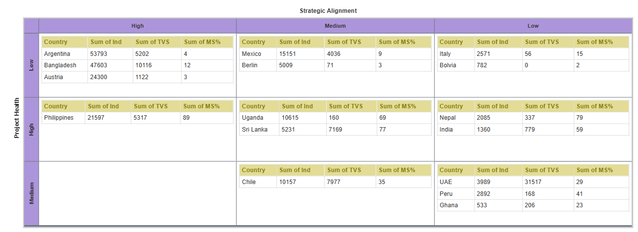
Johari Window by Dunboxed
A customizable grid chart for self, team, and strategy insights in Power BI, inspired by the Johari Window model, but fully extended to support multiple grid layouts beyond the classic 2x2 view. It helps organizations visualize self-awareness, team feedback, hidden factors, and discovery insights in a flexible, structured way.
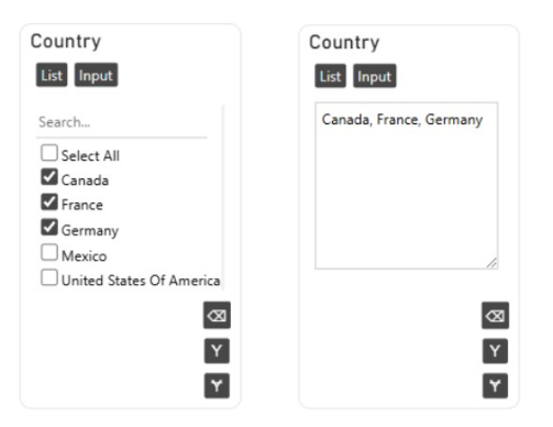
Custom Filter Visual
A powerful filtering visual with List and Input modes, enabling fast, large-scale filtering using checkboxes or comma-separated value entry
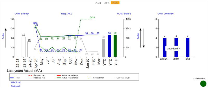
Monthly Combo Visual
An enterprise custom visual designed for multi-metric monthly reporting, featuring multiple chart types, dynamic scaling, and advanced interactivity. Contact us to implement this visual in your Power BI reports.
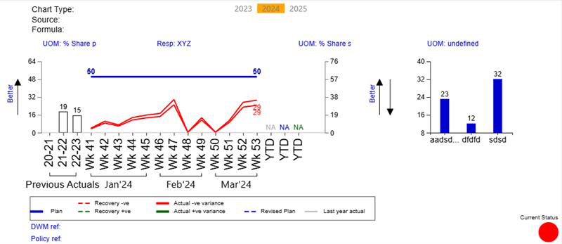
Combo Visual
An enterprise custom visual designed for multi-metric reporting, featuring multiple axis support, dynamic scaling, and advanced interactivity. Contact us to implement this visual in your Power BI reports.